This case study demonstrates how I conducted research and strategized the creation of a design system for the newly revamped DFCC Mobile Banking App and its impact on the design and development process.
P.S. The case study doesn’t reveal the complete design system considering the non-disclosure agreements with the client hence I will call attention to the design process, the process of organizing assets, the challenges we faced, and the final impact of the project.
Overview and the Problem Context
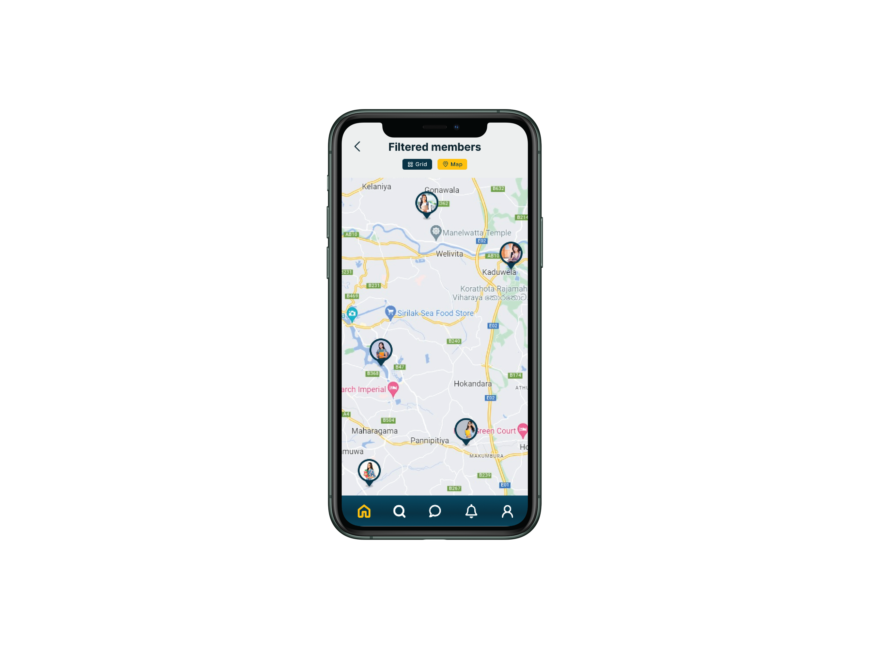
DFCC Mobile Banking App is a project undertaken by Ideahub to revamp DFCC’s existing Virtual Wallet to a more convenient and seamless mobile application with more functionality and better user experience.
The design process of this project was coherent until our UX team encountered an unexpected issue during the initial phases of high-fidelity prototyping. The client requested an additional dark mode version of the app along with the default light mode. However, with the estimations we had already provided, it was impossible to design a dark mode from scratch within the given timelines. So we needed a systematic approach to execute both light and dark versions of the app without significantly extending the project timelines.
My Role
I was tasked with researching possible solutions and mitigating the above-mentioned issue by implementing an appropriate design solution.
Analysing Possible Solutions
Upon research, I figured there were a few major ways to solve this problem. Each solution was analyzed stating its pros and cons to proceed with the best possible solution.
By considering the pros and cons of each of these solutions, I portrayed these solutions in an impact-effort matrix along with the inputs from other designers, to identify and validate the best potential solution.
Accordingly, there were no low-effort solutions to bring about a higher impact. Then we collectively decided to proceed with the high-impact - high-effort solution since it would bring out the best ROI. i.e. to use Figma’s local variables to create a design system, so that we could instantly transfer light mode prototypes to dark mode after making the design system.
The process of creating the design system was challenging and time-consuming yet the result in the end was so worthwhile and provided value to the whole project in terms of making the design and development process faster and more convenient.
The following diagram sums up the process I followed to create the design system. The process was a non-linear and iterative process which required shifting back and forth to certain phases based on user feedback and usability testing results.
Design System Process

1. Approval
Getting the leadership on board to acquire time and resources to create a design system was a major challenge. Despite the initial reluctance, receiving approval from the leadership required explaining the future value of a design system and how it can elevate the design and the development process.
2. Discovery
● Identifying the target users
Primary Users (Users who will directly utilize and manage the design system) - UX Designers, UI Engineers, IOS and Andriod Developers
Secondary Users (Users who won’t directly use the design system but will benefit from it) - Business Analysts, Project managers, QA Engineers
● Research
Even though I have used components and styles from other design systems before, this was my first project creating an actual design system. Therefore I started the project with thorough research. I searched the web for articles and guidelines and referred to many top-recognized design systems such as material design by Google, Human-interface guidelines by Apple, Atlassian Design System, Polaris Design System by Shopify and many more. I checked with other designers who have faced similar challenges to what we are facing now to understand viable solutions. Then I learned how to create an actual design system using local variables through YouTube tutorials and other articles.
3. Definition
Based on research data, I created a checklist to define what needs to be done to properly implement a design system.
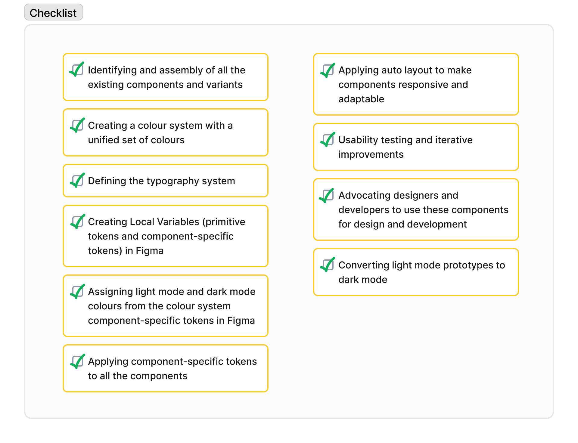
4. Building
● Identifying and assembly of all the existing components and variants
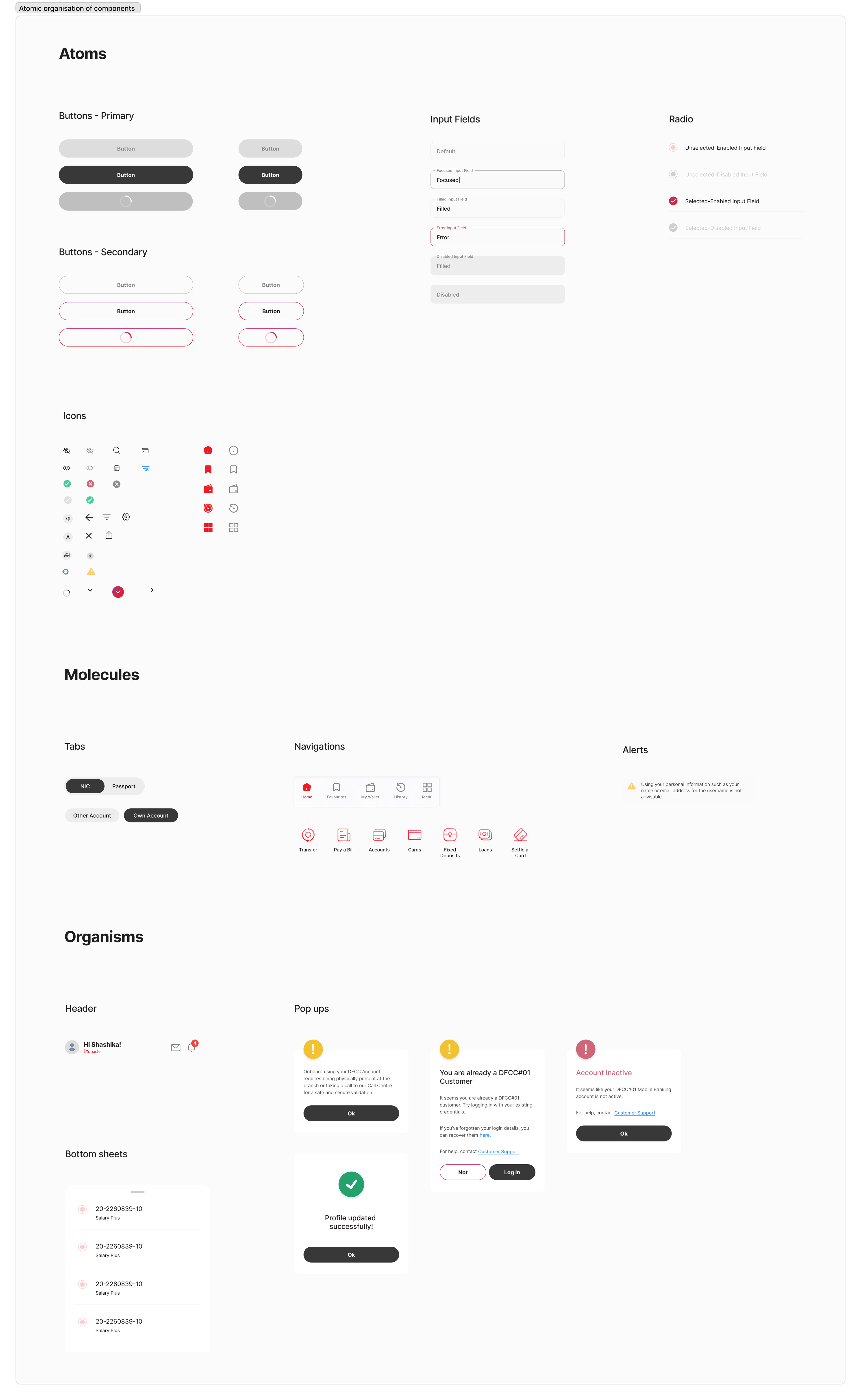
I used the concept of ‘Atomic Design’ to create the design system, which is a methodology for creating design systems that emphasises breaking down user interfaces into smaller and reusable components. This method helped me to assemble all the existing components in an orderly manner.
● Organising atoms, molecules and organisms
● Creating a colour system with a unified set of colours
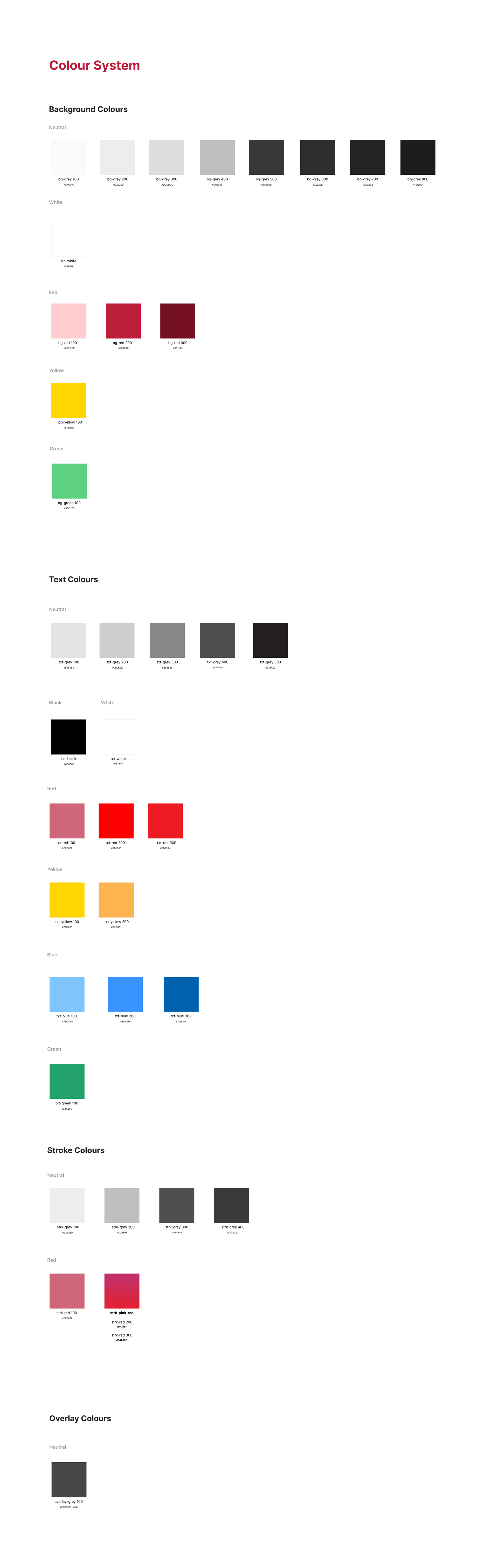
Then I examined all the colours that have already been used in the designs and created a unified colour system to make sure we don’t use many inconsistent color schemes when designing.
Since we needed more contrast across our designs, I created separate colour palettes for backgrounds, texts, strokes and overlays.
● Defining the typography system
Similar to the colour system, I examined all the titles, headings, sub-headings and body texts that have already been used and created a unified system by removing redundant text styles.

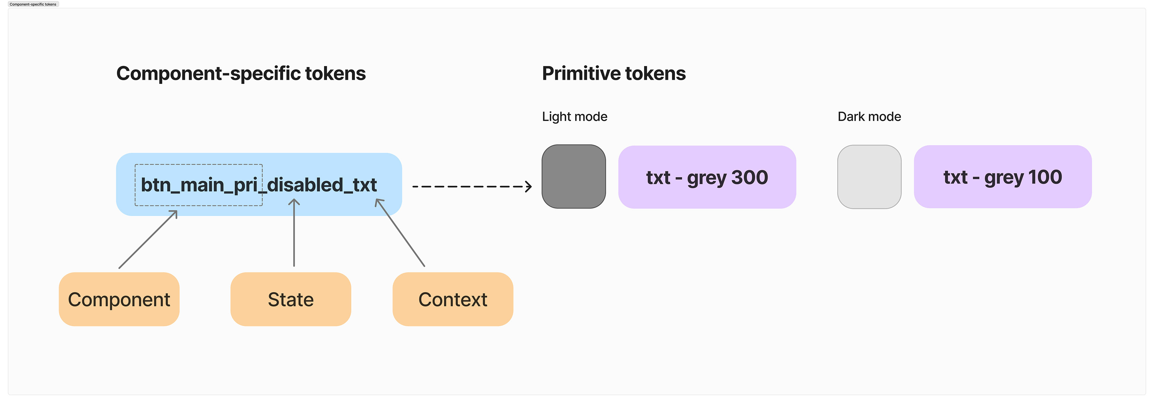
● Creating Local Variables (primitive tokens and component-specific tokens) in Figma
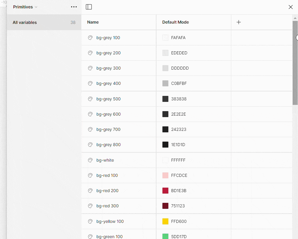
After identifying all the necessary elements, a set of primitive tokens was added using local variables in Figma to represent all the colours used in the design system. The primitive tokens were named so that they represent a few key pieces of information necessary for designers and developers. The following is an example of a primitive token.

Following is a glimpse of all the primitive tokens after they have been added to local variables in Figma.
Component-specific tokens were more specific and detailed and each component-specific token was assigned with two primitive tokens to represent the colours in the light mode and dark mode. The process of creating component-specific tokens was relatively more time-consuming and challenging since each atom of the atomic design system required a component-specific token. As an example, a button with a text, background and stroke required 3 component-specific tokens to assign colours for its text, background and stroke. In this manner, every atom in the design system was given a specific name. Following is an example of a component-specific token and its primitive tokens that were assigned to represent colours in the light mode and dark mode.
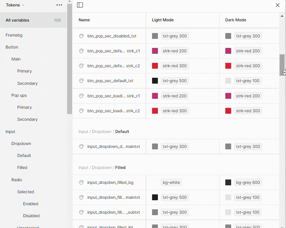
Following is a glimpse of all the component-specific tokens after they have been added to local variables in Figma.
Creating tokens in Figma not only helped the Designers to seamlessly shift light mode prototypes into dark mode but also, helped the developers to translate the designs into code by using the same token structure thereby reducing their development efforts.
● Applying auto layout to make components responsive and adaptable
Applying auto layout to certain components in Figma helped the Designers to easily add or remove elements/atoms to the components without damaging the layout, spacing and structure of the components. This made the design process more efficient since it reduced the time to make different types of components from scratch.
5. Documentation
For the target users to understand and utilize the design system, effective documentation is a must. Considering the scope and how the design system is going to be used, we decided to use our existing design file to host our assets and design documentation. This suited our current workflow and helped to keep everything in one place.
To advocate all the necessary information annotations were used in relevant places that require the user’s attention. In this manner, users won’t miss the key pointers that need to be understood when using the design system.

6. Testing
Testing the design system with the target users was an integral part of the process. The design system was tested with the primary target audience (UX Designers, UI Engineers, iOS and Android developers) with a diverse representation from each group for its usability, learnability and efficiency.
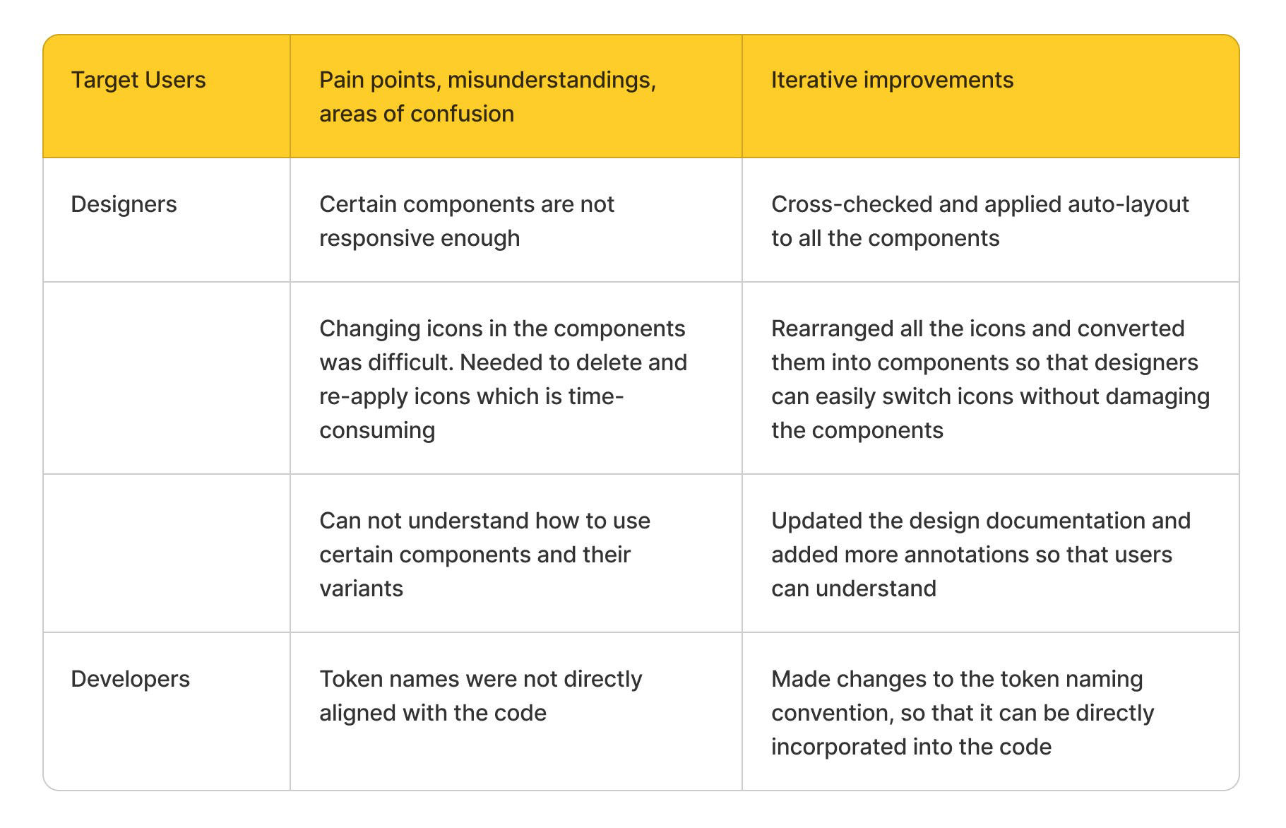
The testing process was planned in the following manner to suit the scope and nature of this project. First moderated sessions were conducted with each target user by assigning them a simple task to complete using the design system. As an example designers were allowed to design a simple card by using the components in the design system and developers were allowed to code it. Through careful observation, I paid attention to how each user interacted with the design system and recorded the difficulties they encountered, pain points, misunderstandings areas of confusion across different user groups while completing the tasks.
In addition, structured feedback forms were provided to each user to gather qualitative and quantitative feedback.
Following is a summary of the difficulties the users encountered and iterative improvements made to the design system based on feedback.
After making the improvements, follow-up tests were done to validate improvements until the identified issues were mitigated effectively.
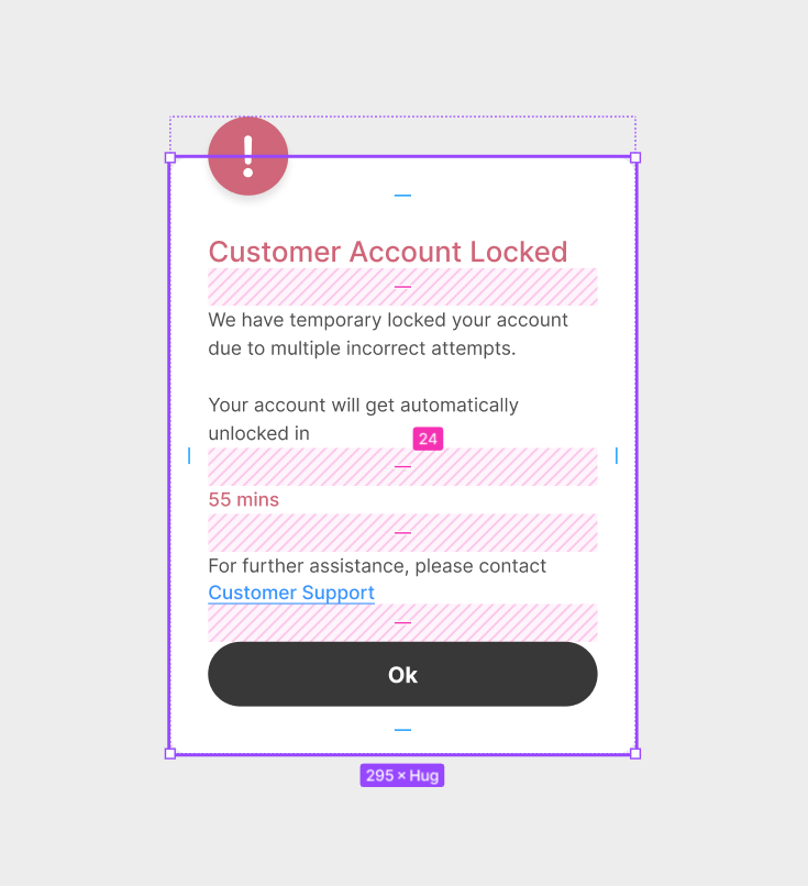
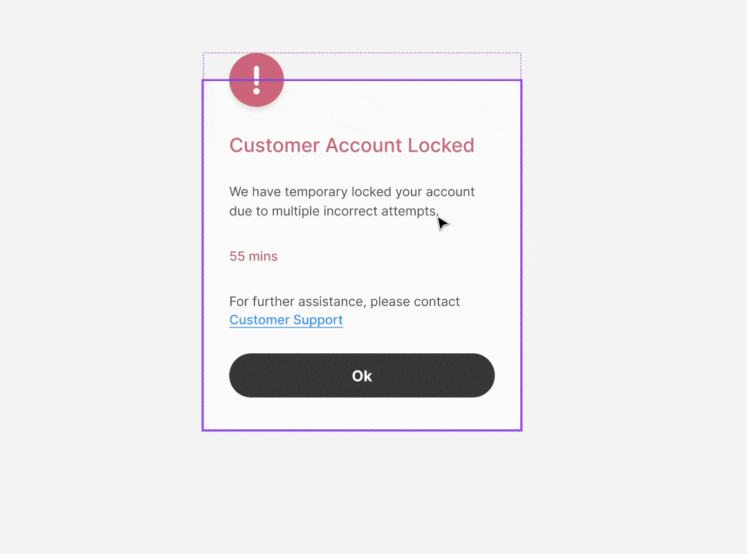
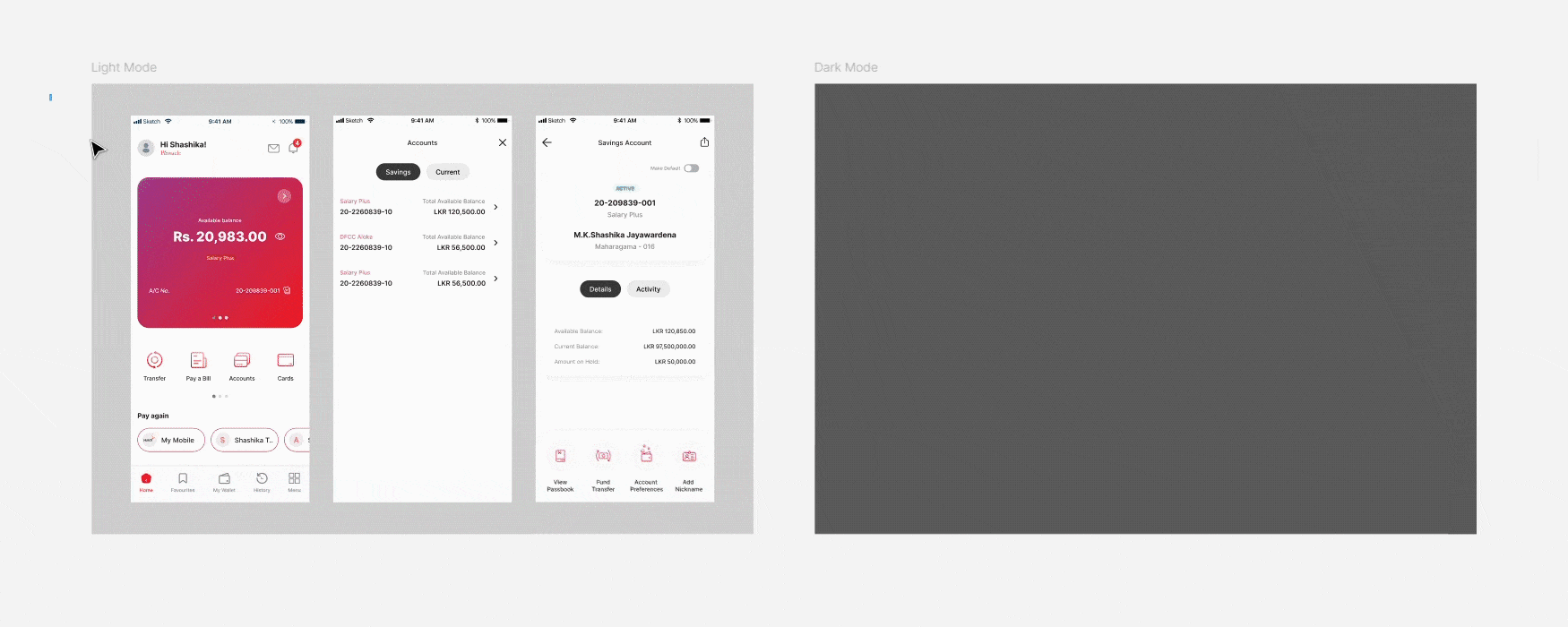
After a few iterations of improvements, the design system was ready to be socialized into the company and converting light mode prototypes to dark mode, which were designed using the components in the design system was an effortless and smooth task which required only a few seconds as shown below.
7. Advocacy and Maintenance
To socialize the design system to the company workflow I conducted a session with the target users to enlighten how the design system addresses current pain points, enhances efficiency by reducing design and development time, ensures consistency and ultimately improves user experience.
This was followed by a workshop for the primary users to introduce the design system, its components and variants and usage guidelines, also educating them on how to maintain and update the design system to ensure its relevance and effectiveness over time.
Measuring the success of the design system
After several rounds of iterative improvements, surveys were conducted with the primary users to measure the efficiency gains as well as to gather qualitative feedback. To quantitatively analyse efficiency gains for the design and development process, “Time on task” was calculated by considering the time spent by designers and developers to complete several journeys before and after the usage of the design system. The results were as follows.


According to the above two graphs, it is evident that after using the design system, there is an average reduction of 52% in time on task for designing and a 53% reduction in development times, confirming that the incorporation of the design system made the design and development process 2X faster.
Qualitative feedback

Conclusion
It took roughly a month to complete the design system from receiving leadership’s approval to testing and socialising the design system. Even though the initial plan was not significantly to extend the project deadlines, it had to be extended to craft the design system. But when considering the bigger picture under the above success matrix, utilization of the design system approximately makes the design and development process twice as fast as it would be without a design system. Therefore it is safe to assume that the project timelines could be cut in half in the long run if any other issues are unmet, thus validating the importance of the design system.
Learnings and retrospect
After all the most important learning outcome for me in this project was understanding that it is worthwhile to spend time and effort to craft a design system for large-scale projects because it is a long-term investment that saves future design and development times, maintains consistency and supports scalability. Further, understanding the importance of gathering and integrating feedback from various team members and the need for continuous usability testing to improve the design system was a major learning. When socializing the design system I realized the importance of clear and detailed documentation and proper communication to help new team members quickly understand and use the design system.
Reflecting on these learnings and insights I intend to refine my approach to future projects, aspiring to become a more effective and strategic UX designer.