Overview and Problem Context
eZ Cash Merchant App is a digital product owned by Dialog Finance designed for Android devices. The primary users of this product are Dialog Finance registered merchants who perform different activities such as bill payments, bank deposits, bank withdrawals, customer top-ups, and a few more services for the customers who visit these merchants’ retail stores. Currently, this app is being used by more than 10,000 retailers Island wide and monthly an average of more than 600,000 transactions are being performed by these Merchants.
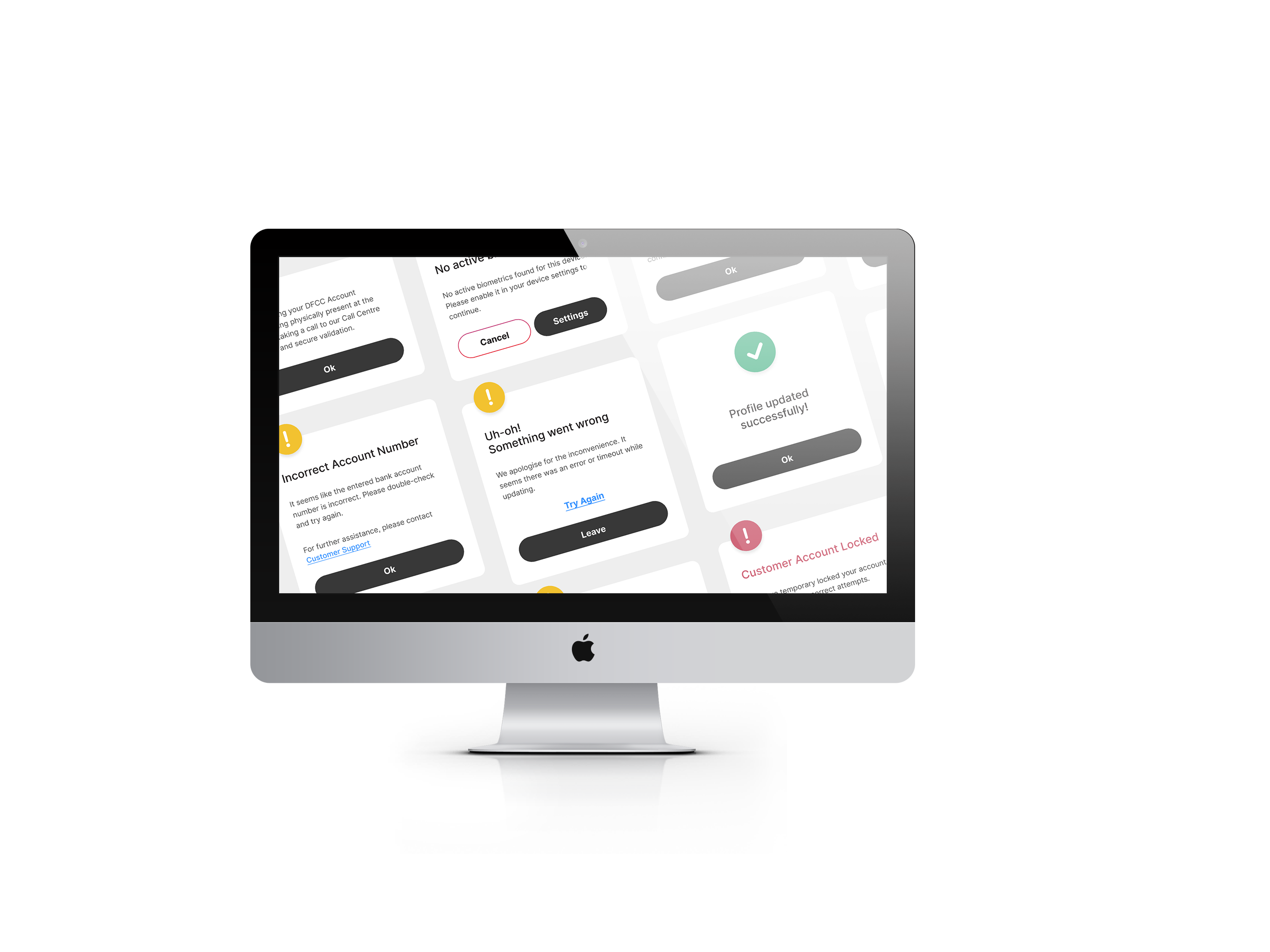
However, despite the app being popular and vital among users, there are a few pain points that disappoint the users making them less efficient amidst their busy schedules dealing with many customers within a day. This often makes them turn towards competitor products because of their ease of use and efficiency.
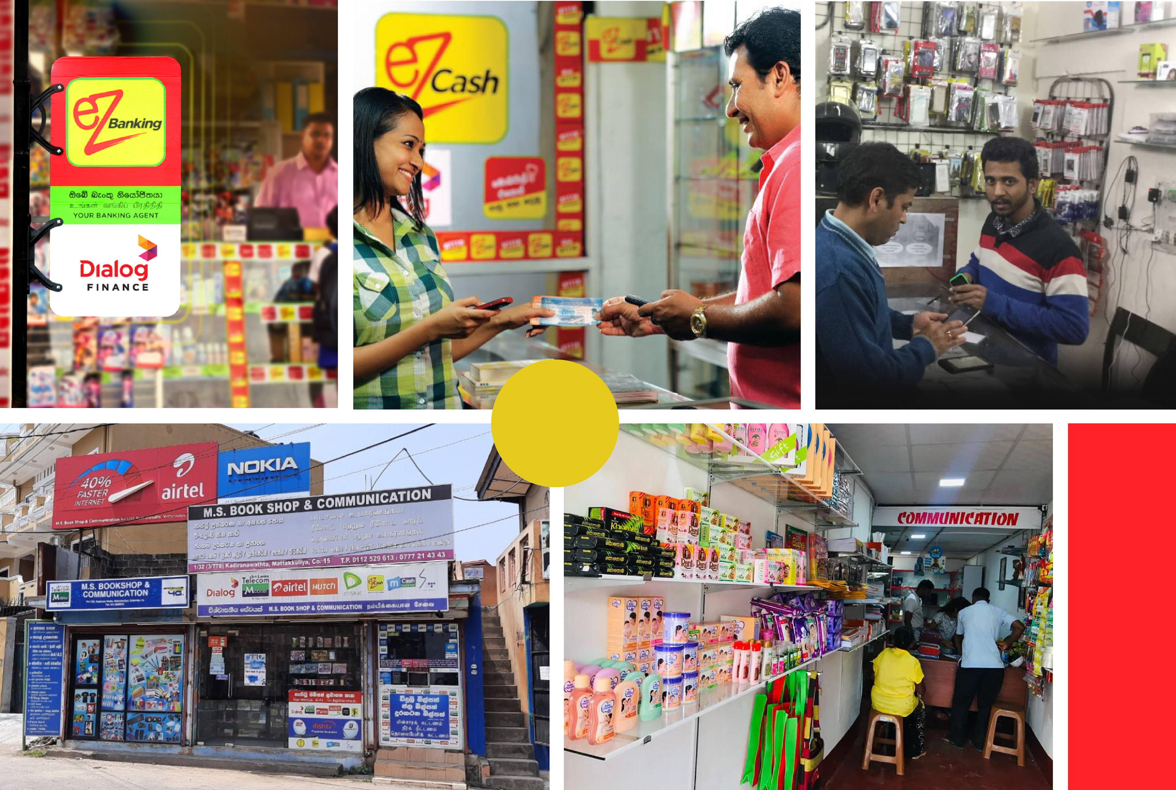
Moodboard Portraying Merchants' Lifestyle
My Role
As the UX designer assigned to this project, I had to work closely with Business Analysts, Project Managers and Engineers from our company and key stakeholders from client-end such as Product & Project Managers, to gather insights, conduct primary and secondary research, discover opportunities to design a revamped app that solves existing customer pain points.
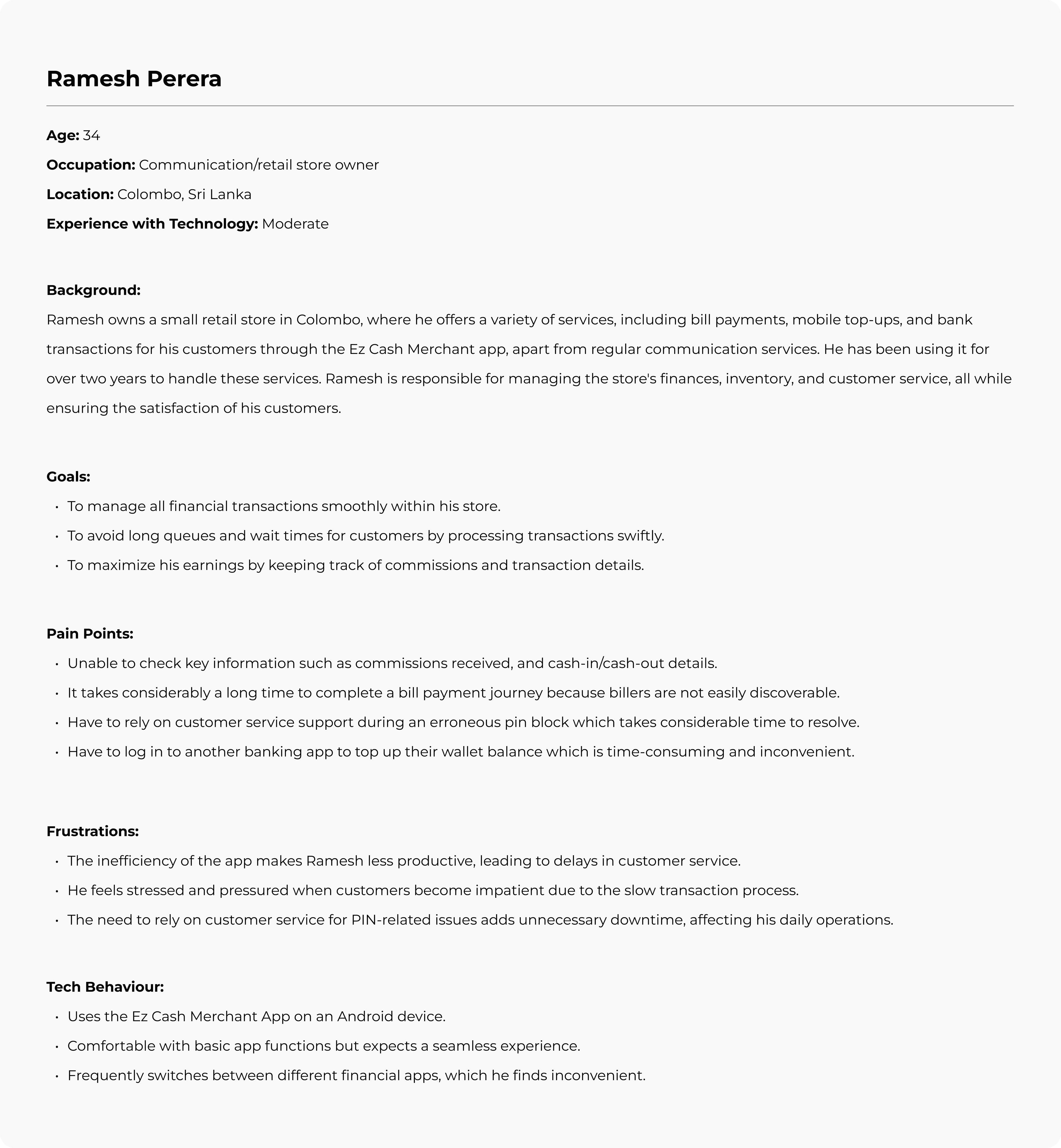
Understanding more about the User
I conducted contextual inquiries with 5 users around Colombo, by visiting their retail stores and mapped out the following persona which encapsulates key information about a typical user’s behaviour.
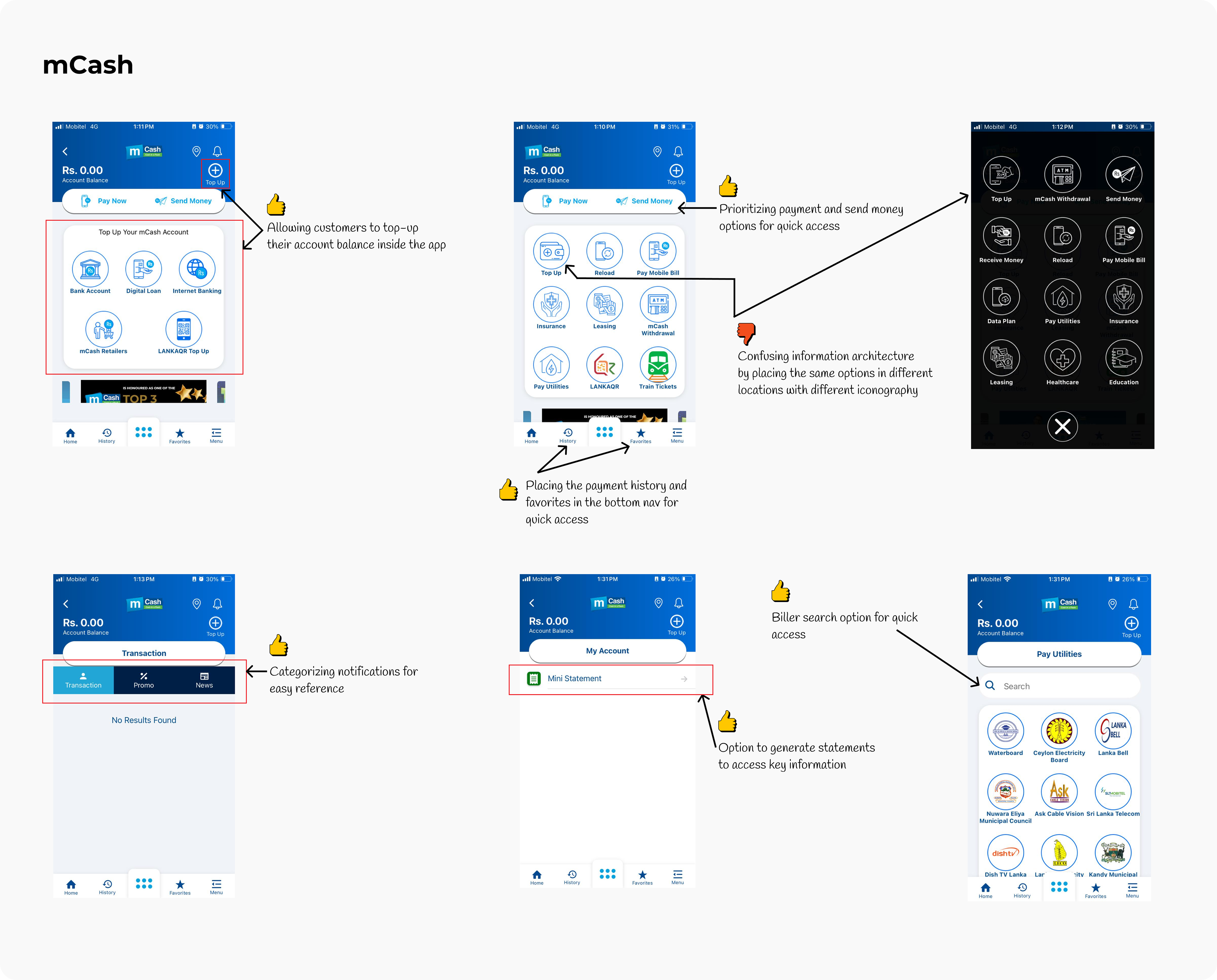
Competitor Analysis
In addition to the above findings, since the users have a higher tendency to switch to competitor products I conducted a competitor analysis to gain useful insights.


Opportunities for Improvement
After analysing the research data gathered about the users and the competitor products I finalised the opportunities for improvement by validating them with the client’s Business Unit.
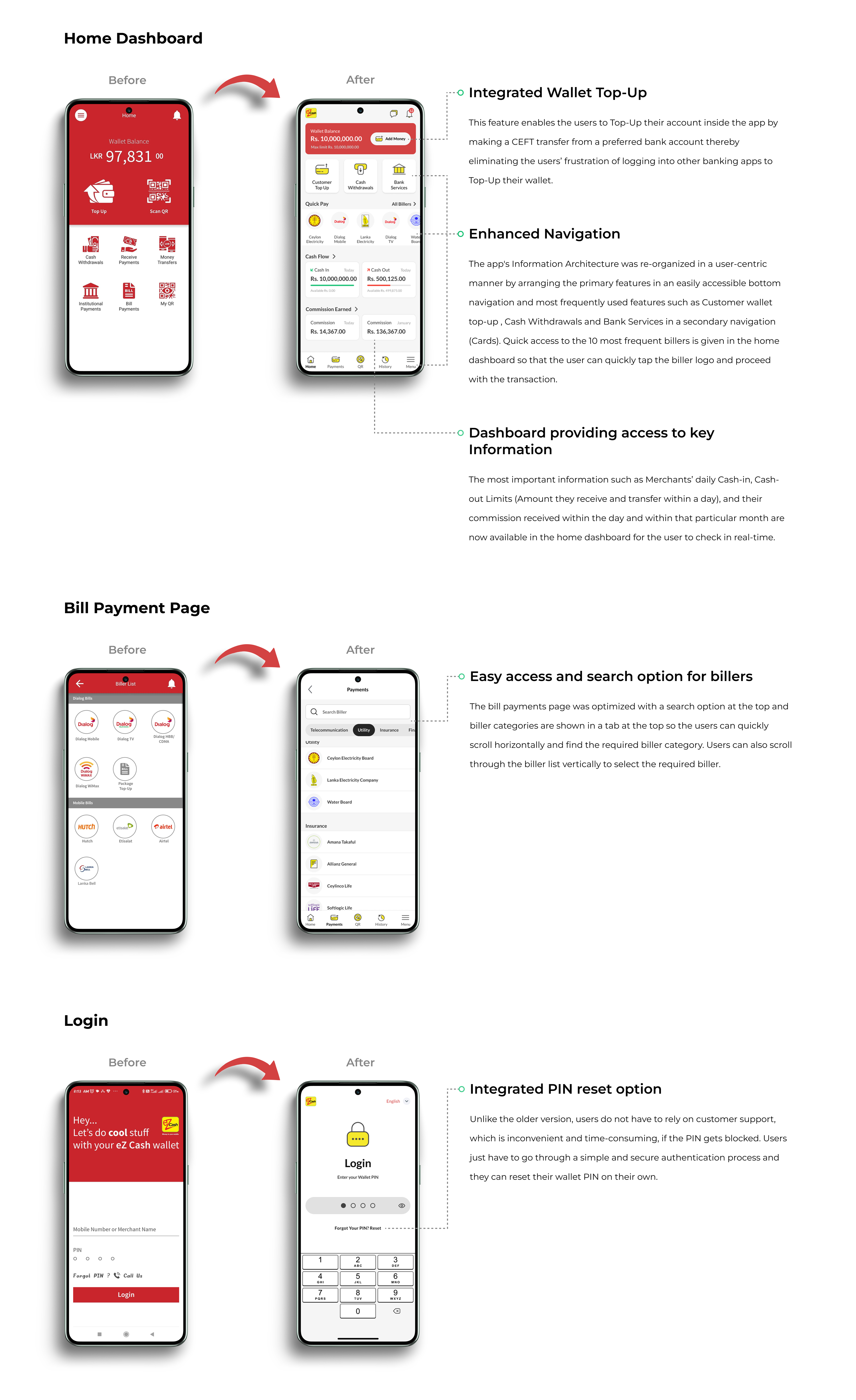
1. Enhanced Navigation: Improve the app’s interface to make billers easily discoverable, reducing transaction times.
2. Access to Key Information: Provide a dedicated section for merchants to view commissions, cash-in/cash-out details, and transaction history in real time.
3. Integrated Wallet Top-Up: Allow wallet top-ups directly within the app without needing to log into another banking service.
4. Faster Issue Resolution: Implement a quicker, more efficient process for resolving PIN blocks and other issues, possibly through in-app support or automation.
Wireframing, Mid-Fidelity Prototypes and Iterations
I visualised the potential solutions through quick wireframing while gaining feedback from UX leads. This method allowed me to engage in a faster iterative process, without devoting much time to make changes to the designs. After sketching several iterations of wireframes, I converted them to mid-fidelity prototypes in Figma where I could conduct Usability tests with the potential target users and pitch to stakeholders for their approval.
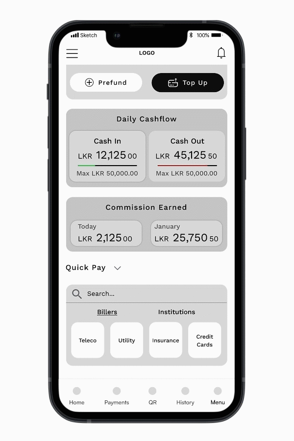
Home Dashboard
Considering their easy and quick access, I explored different ways of portraying billers. I reorganised the app's Information Architecture while wireframing to prioritise the most frequent and essential features. I also explored different ways of utilizing the UI real estate efficiently.

Mid fidelity Prototype and Usability Testing
Wireframes were converted to a clickable Mid-fidelity prototype in Figma and tested with 5 merchants for their usability. All the Merchants found the new design much more convenient than the existing app. However, 3 of 5 merchants took relatively a longer time to complete a bill payment journey which confirmed that it was still not very efficient.
So I decided to find another approach to make the bill payment journey faster. While talking with the Merchants further, it revealed that there are around 5 - 10 billers that customers use more frequently to pay bills. The rest of the billers are very rarely utilized by the customers who visit these Merchants. So if only these billers are given quick access through the app, the bill payment journey will become more efficient. With this insight, I redesigned the dashboard allowing access to the 10 most frequent billers used by a particular Merchant and again conducted usability tests. This time the Merchants took much less time to complete a bill payment journey by quickly selecting a biller from the home dashboard.
Final Mockups
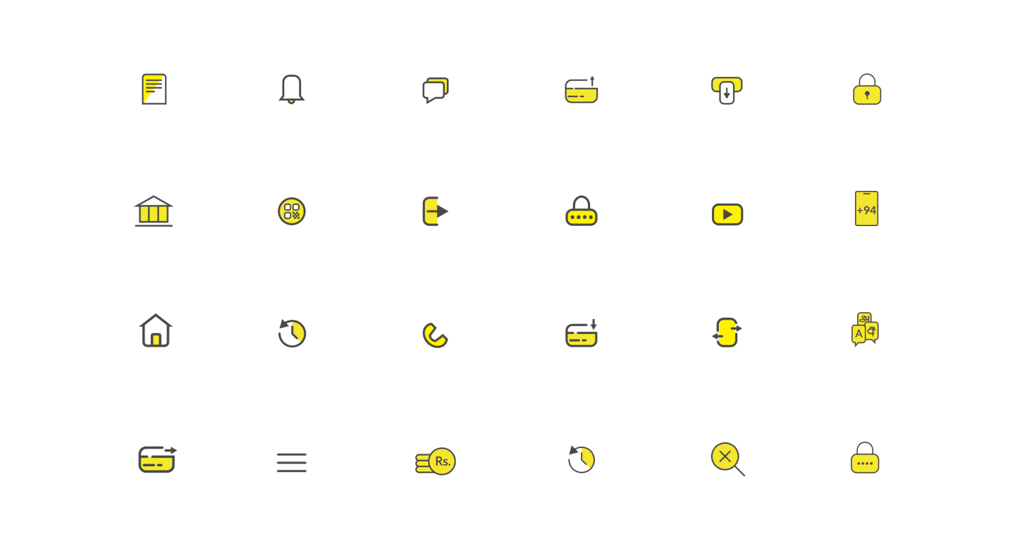
Custom Iconography
I designed all the icons in the app from scratch using Adobe Illustrator to match the visual appeal of the app. Using custom iconography helped to complement the unique features and interactions in the app creating a delightful user experience.
Qualitative Feedback from Merchants
“Taking the most frequent billers to the home screen will reduce the time we spend finding billers scrolling through the biller list.”
“The ability to top up my wallet through the app itself is so convenient. Sometimes when we log into other banking apps it takes so much time. Not having to keep the customers waiting is so relieving.”
“Sometimes when I’m busy I rush to enter the PIN and enter the wrong PIN several times and it gets blocked. Having the option to reset the PIN right away through the app is time-saving than calling customer support.”
“The ability to view cash-in and cash-out details makes us aware of the remaining amount that we can receive to our wallet and transfer from our wallet. Earlier we couldn’t see that. We could only see an error message when we tried to perform a transaction. This is more trouble-free than the earlier version.”
Conclusion
The revamped eZ Cash Merchant App successfully addressed the primary pain points identified in the initial research through a user-centred approach. By enhancing navigation, integrating a wallet top-up feature, improving access to key information, and streamlining the bill payment journey, the app now delivers a more efficient and user-friendly experience. During usability testing, the positive feedback from merchants confirmed that the new design significantly improved their productivity, reducing delays and frustrations that previously led to inefficiencies and customer dissatisfaction.
Learnings and Retrospect
This project highlighted the importance of deeply understanding the needs of target users through contextual inquiries and iterative testing. The insight that merchants frequently interact with a limited set of billers was pivotal in refining the app’s design for greater efficiency. Moreover, I realised the value of rapid prototyping and continuous stakeholder collaboration, ensuring that the design decisions are aligned with both user needs and business goals. In addition, I recognised the importance of balancing user feedback with innovative design solutions to create products that are not only functional but also delightful to use.